
[Linkpost] “Histograms are to CDFs as calibration plots are to...” by Optimization Process
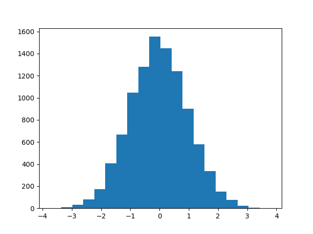
As you know, histograms are decent visualizations for PDFs with lots of samples...
10k predictions, 20 bins
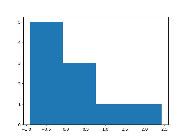
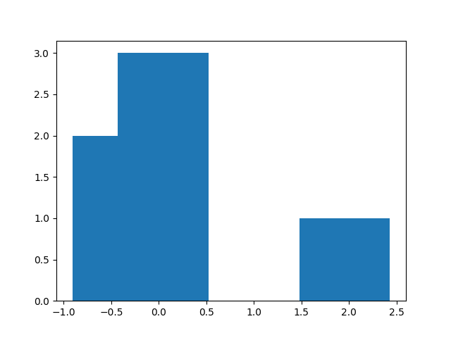
...but if there are only a few samples, the histogram-binning choices can matter a lot:
10 predictions, 4 binssame 10 predictions, 7 binsThe binning (a) discards information, and worse, (b) is mathematically un-aesthetic.
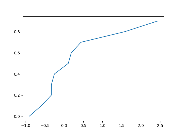
But a CDF doesn't have this problem!
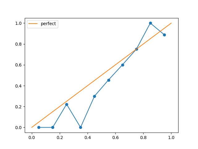
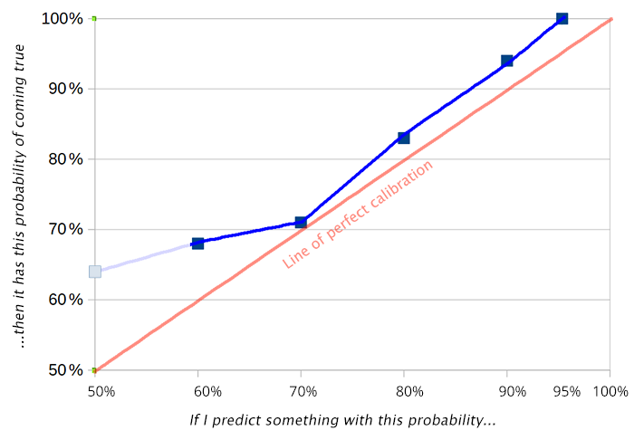
same 10 predictions, every data point precisely representedIf you make a bunch of predictions, and you want to know how well they're calibrated, classically you make a graph like this:
source: SSC's 2019 prediction gradingBut, as with a histogram, this depends on how you bin your predictions.
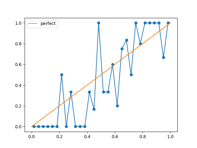
100 predictions, 10 binssame 100 predictions, 30 binsIs there some CDF-like equivalent here? Some visualization with no free parameters?
I asked that question to several people at Arbor Summer Camp. I got three answers:
- "You get from a PDF to [...]
---
First published:
June 5th, 2025
Source:
https://www.lesswrong.com/posts/LFGgwitjertJqch7J/histograms-are-to-cdfs-as-calibration-plots-are-to
Linkpost URL:
https://optimizationprocess.com/calibration-cdf/
---
Narrated by TYPE III AUDIO.
---
Images from the article:
Apple Podcasts and Spotify do not show images in the episode description. Try Pocket Casts, or another podcast app.
Senaste avsnitt
En liten tjänst av I'm With Friends. Finns även på engelska.