
“Semen and Semantics: Understanding Porn with Language Embeddings” by future_detective
Summary
Porn content has gotten more extreme over time. Here's the average title for the first full year of Pornhub's existence, 2008:
- "Hot blonde girl gets fucked"
and here's the average title for 2023:
- "FAMILYXXX - "I Cant Resist My Stepsis Big Juicy Ass" (Mila Monet)"
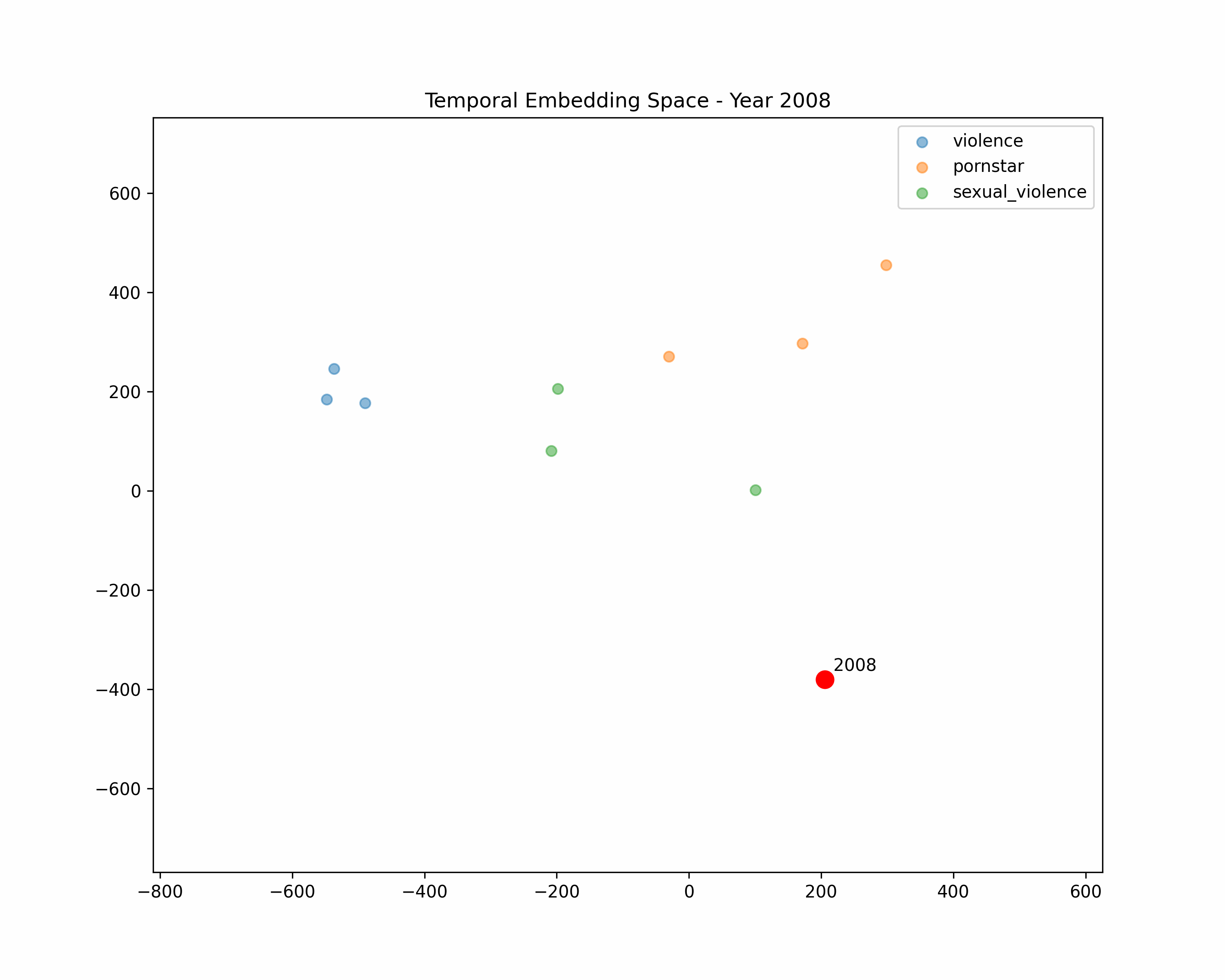
Why did this change happen? We can understand porn's progression by converting titles to language embeddings. I downloaded Internet Archive snapshots of "pornhub.com" from 2008 - 2023 and analyzed the embeddings of the titles on the main page.
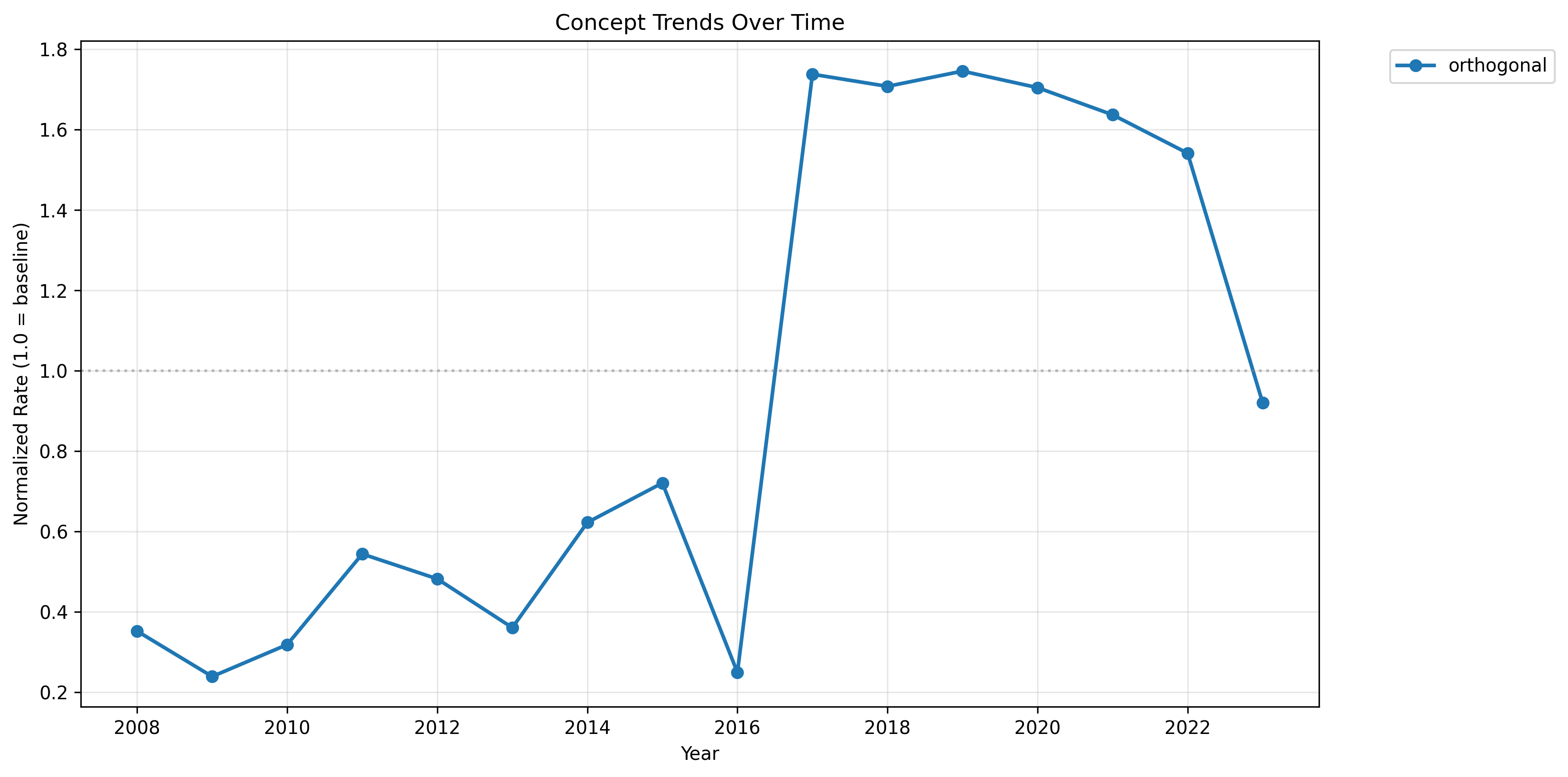
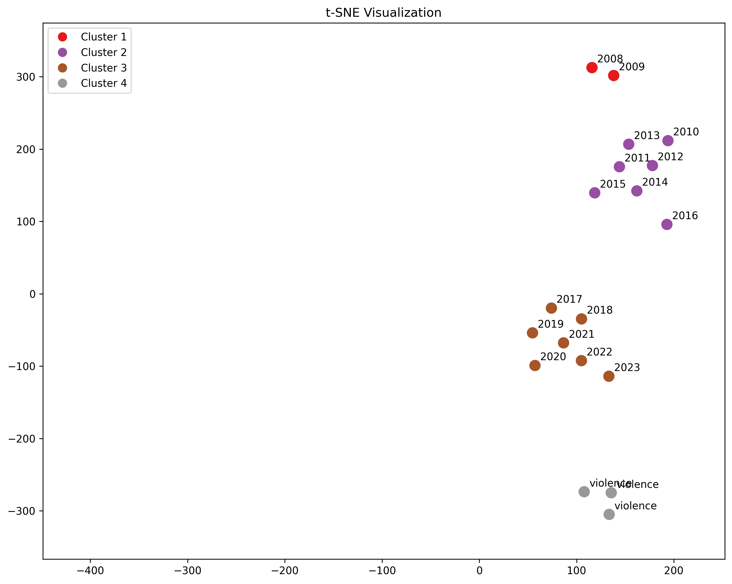
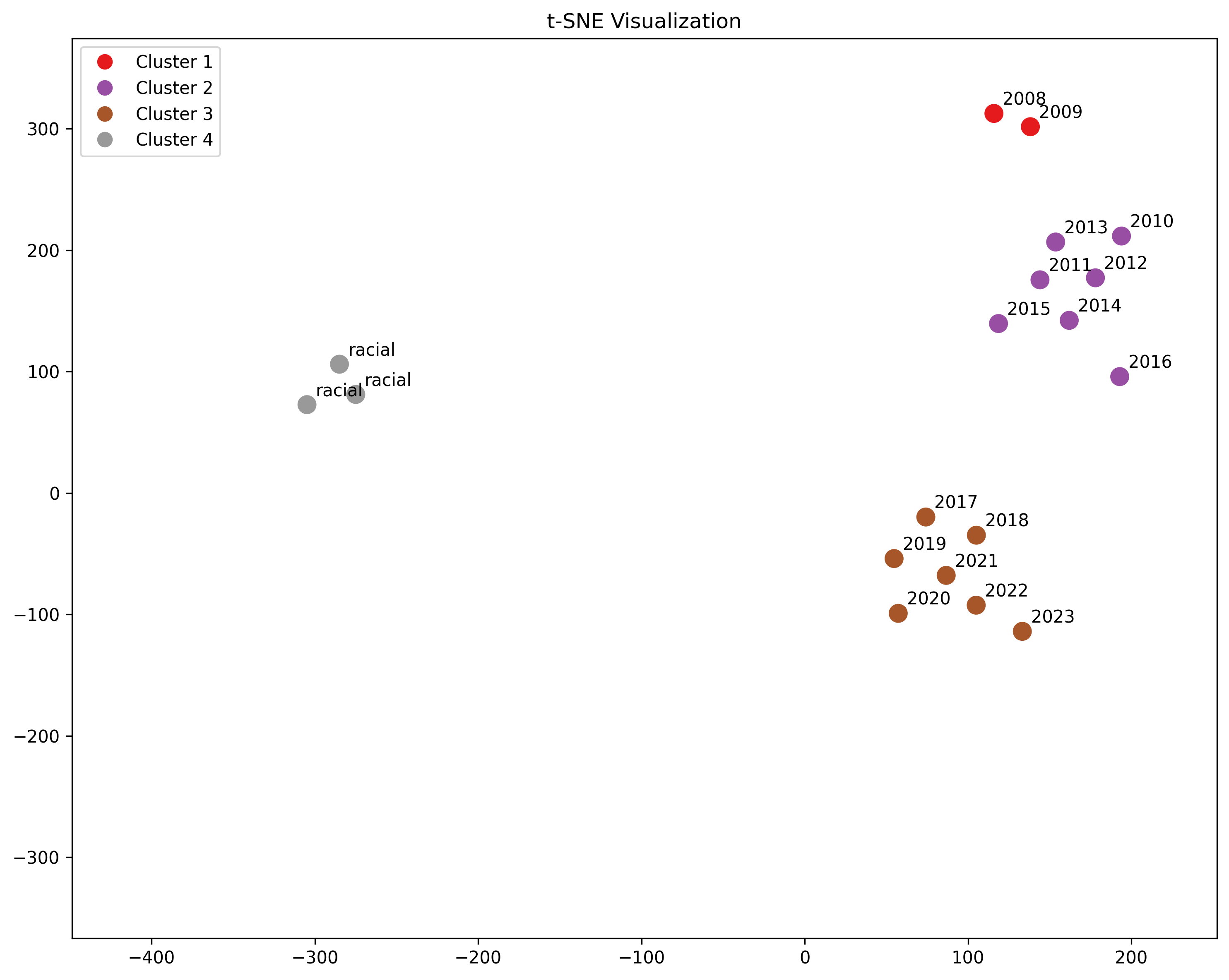
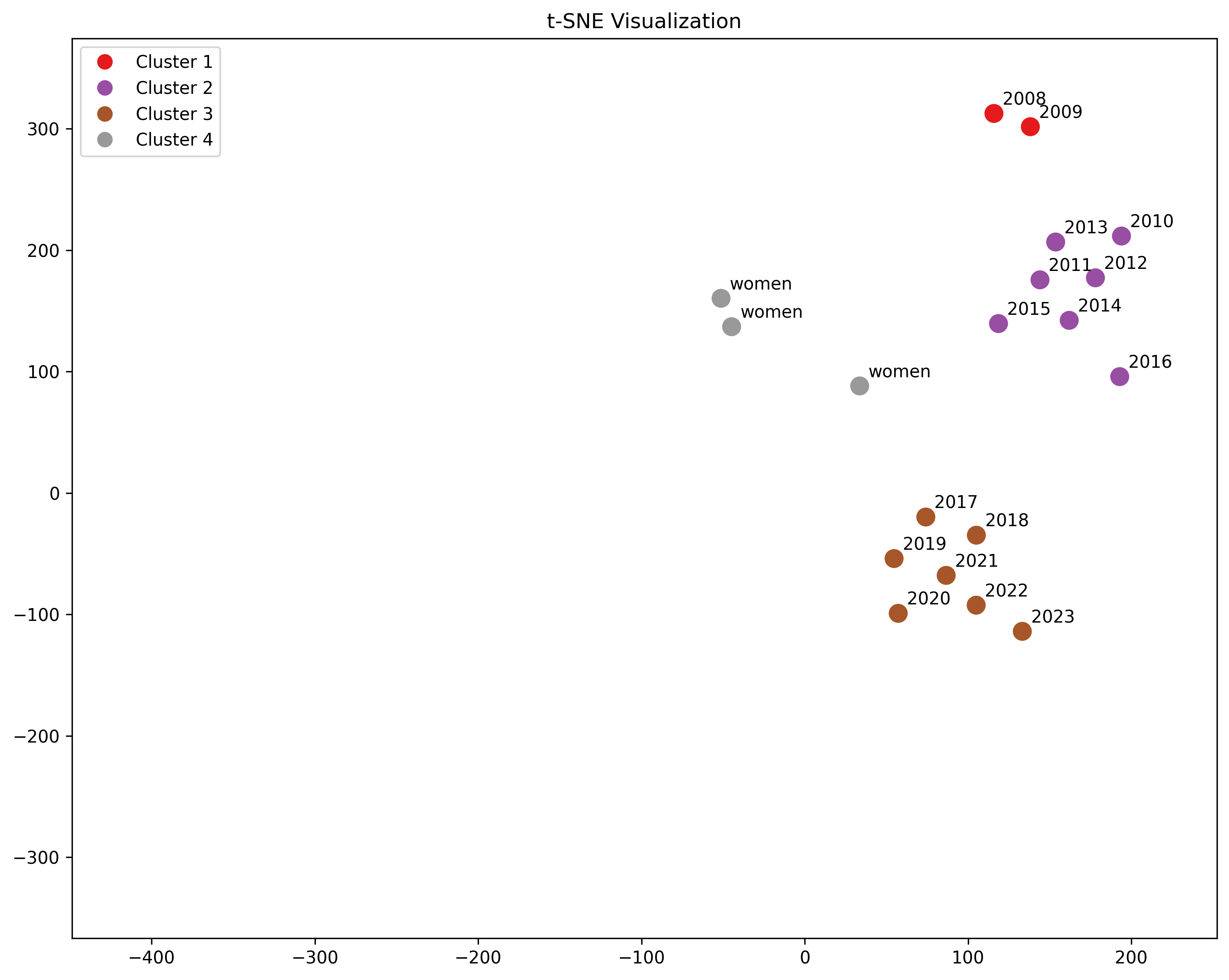
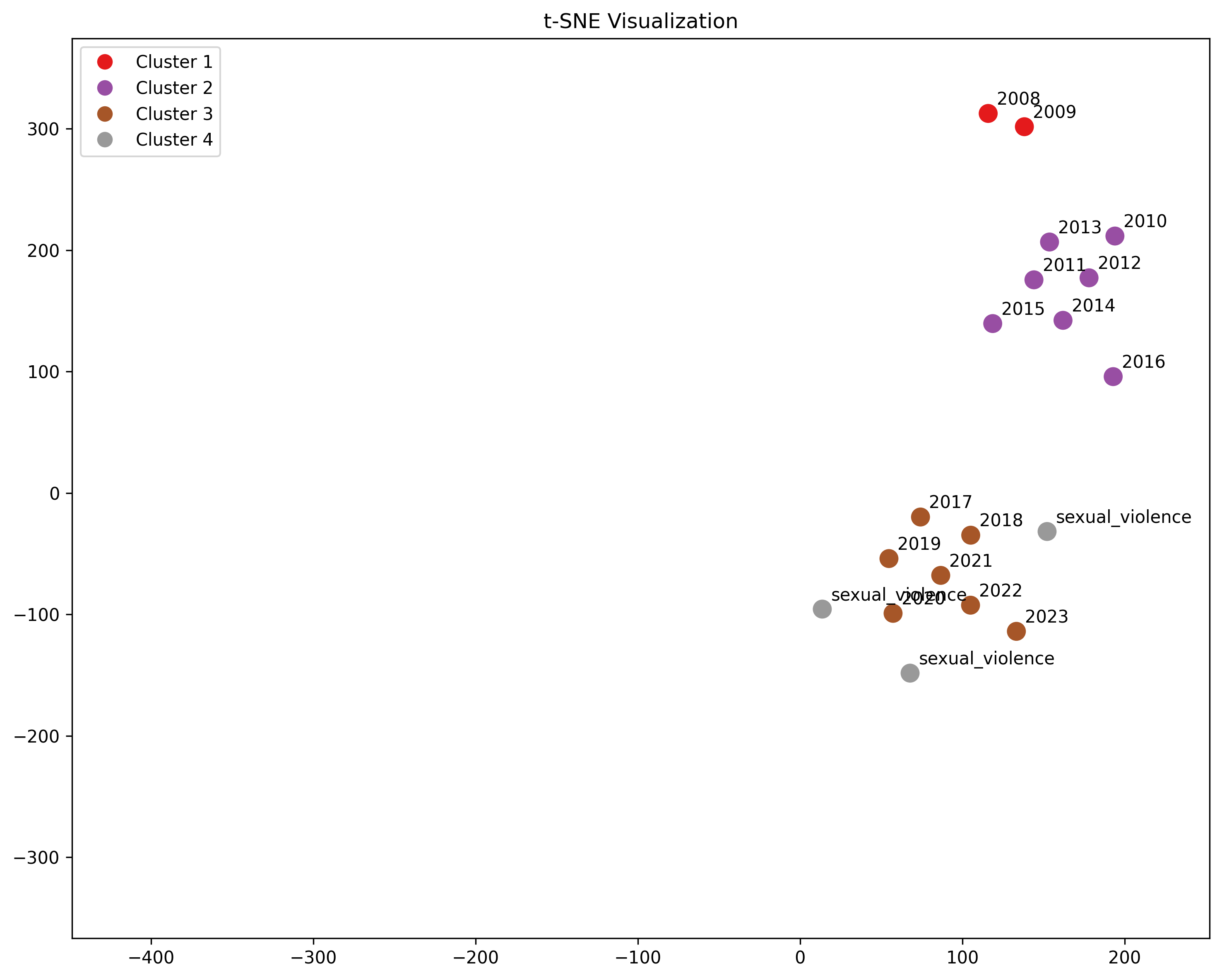
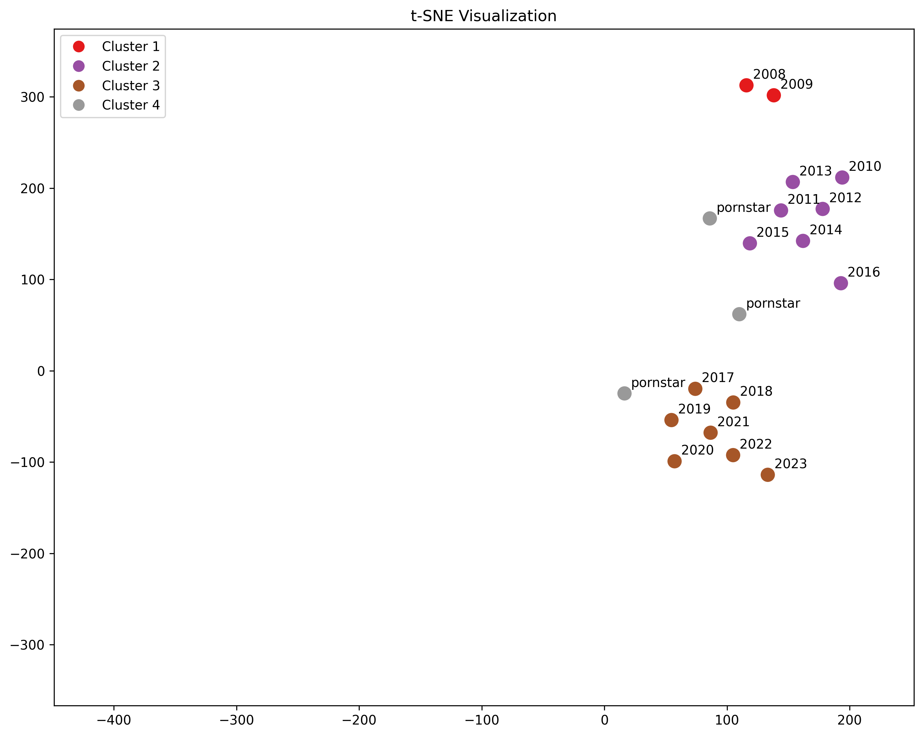
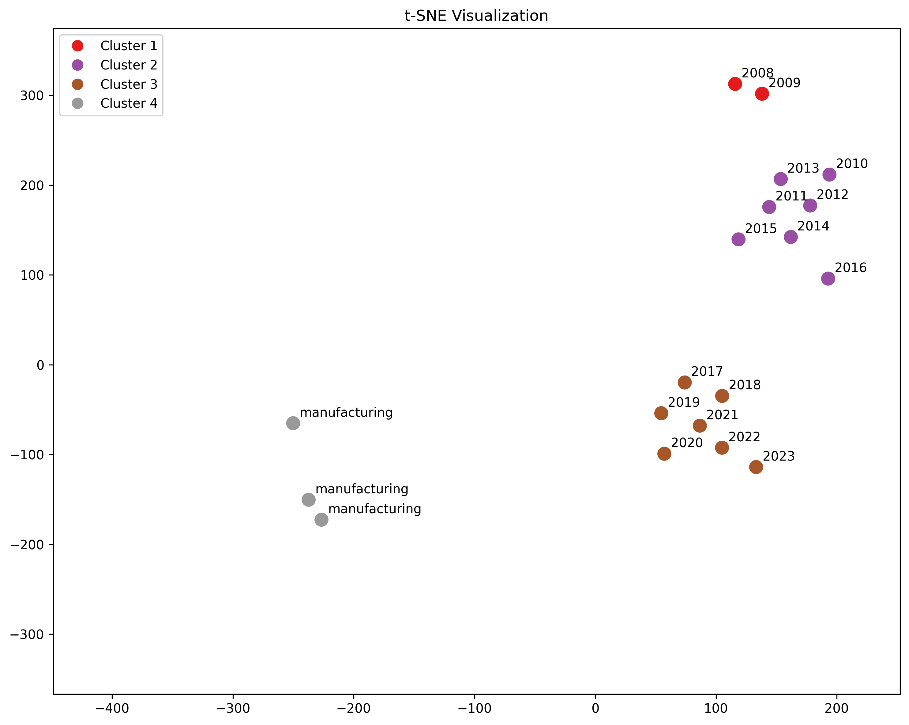
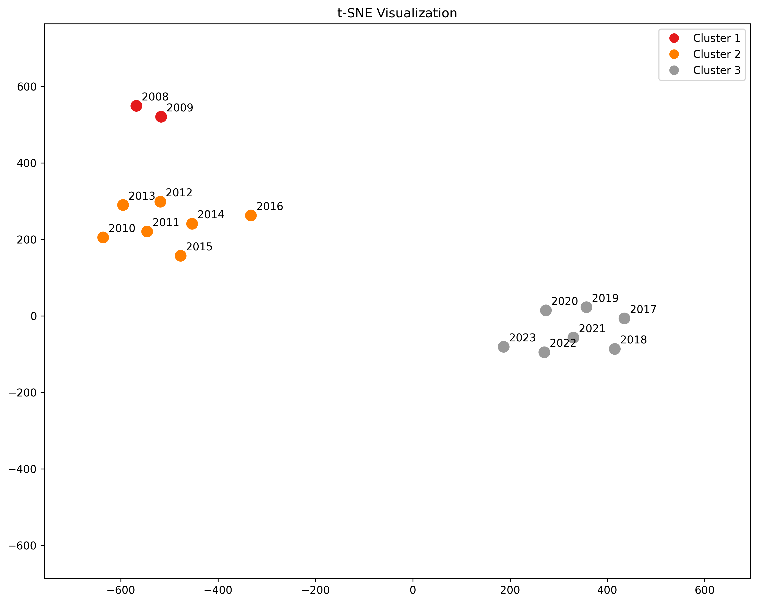
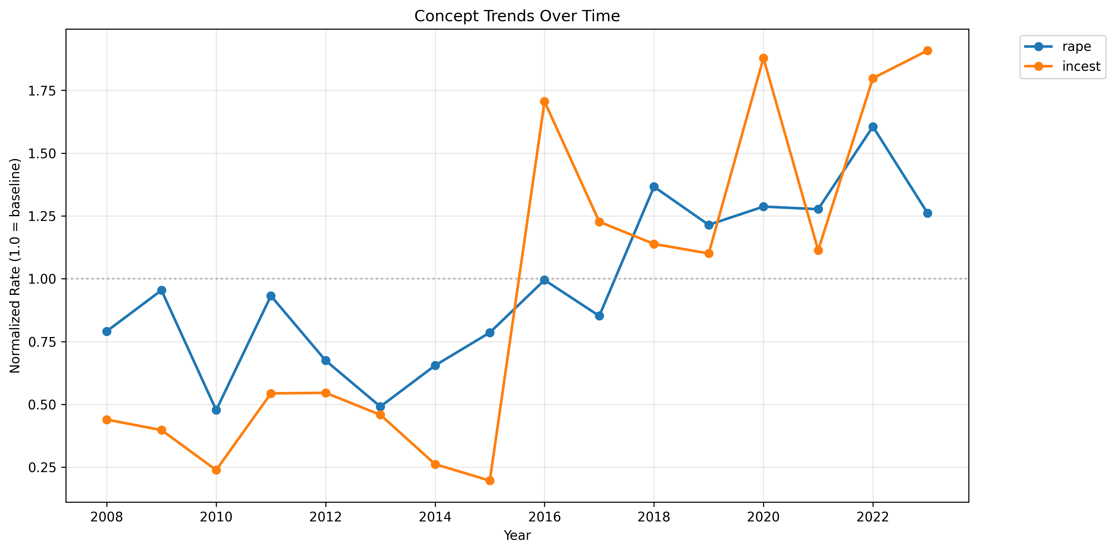
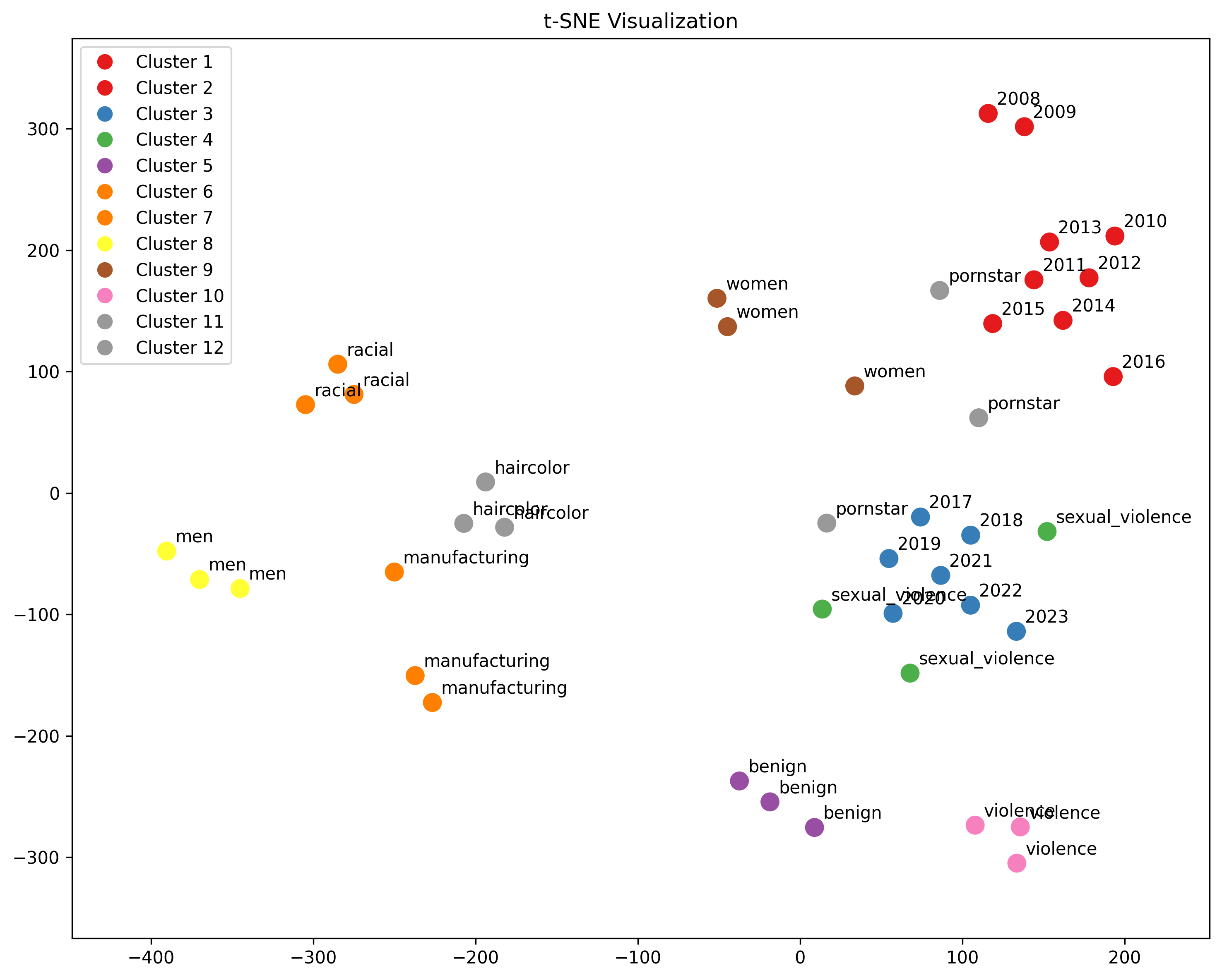
I found three distinct eras of titling: 2008-2009, 2010-2016, 2017-present. The current trend, since 2017, is characterized mainly by an emphasis on incest and other sexual violence.
Titles are generally representative of actual video content, and provide a reasonable heuristic for measuring actual content change, though some SEO effects exist.
The conclusion is a slightly ominous one: we are close to semantic bedrock [...]
---
Outline:
(00:12) Summary
(01:32) Data and Methods
(03:17) Title Accuracy
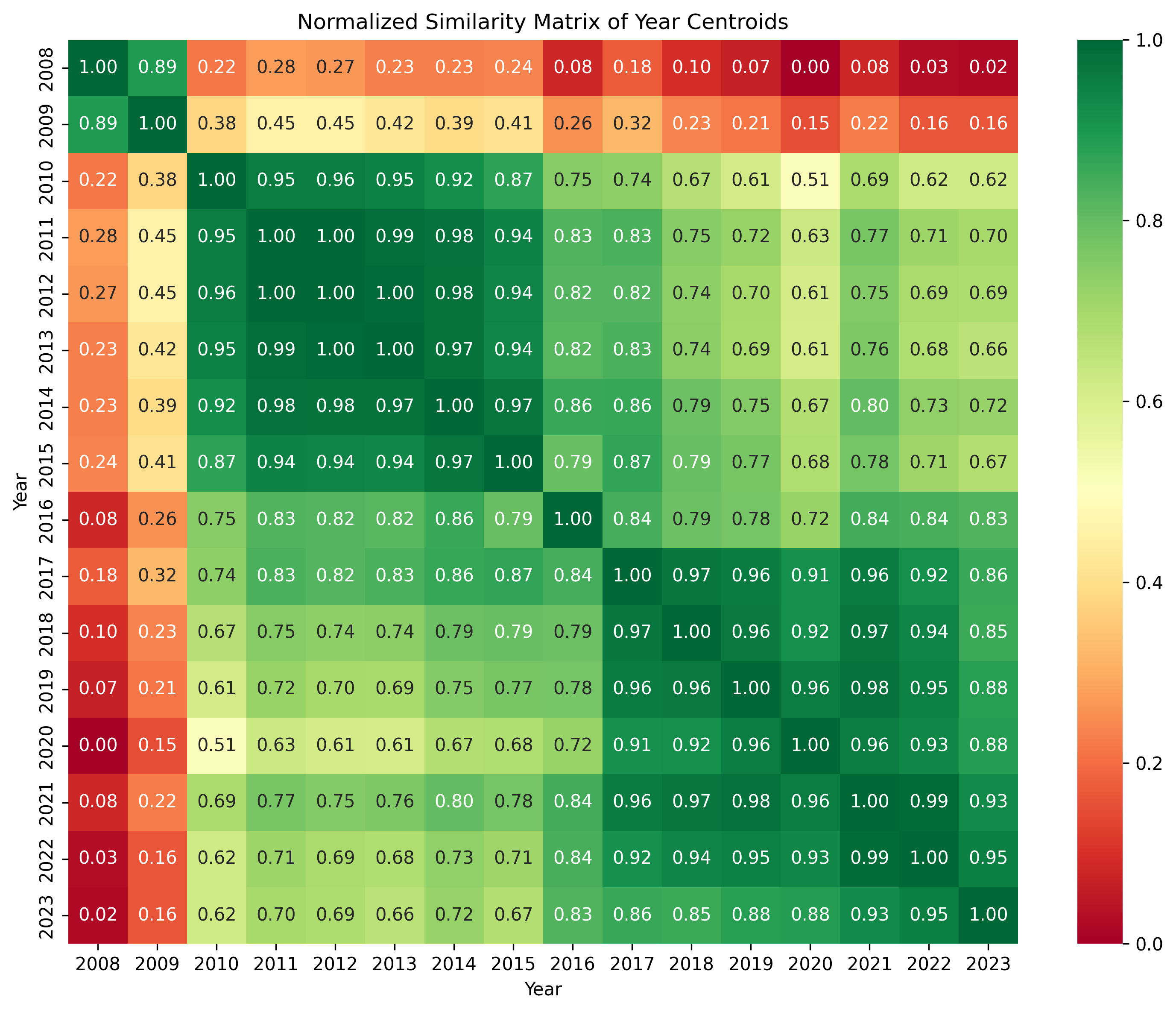
(04:32) Calculating Yearly Centroids
(04:57) Centroid Similarity
(05:32) Centroid Clusters
(06:22) Centroid Titles
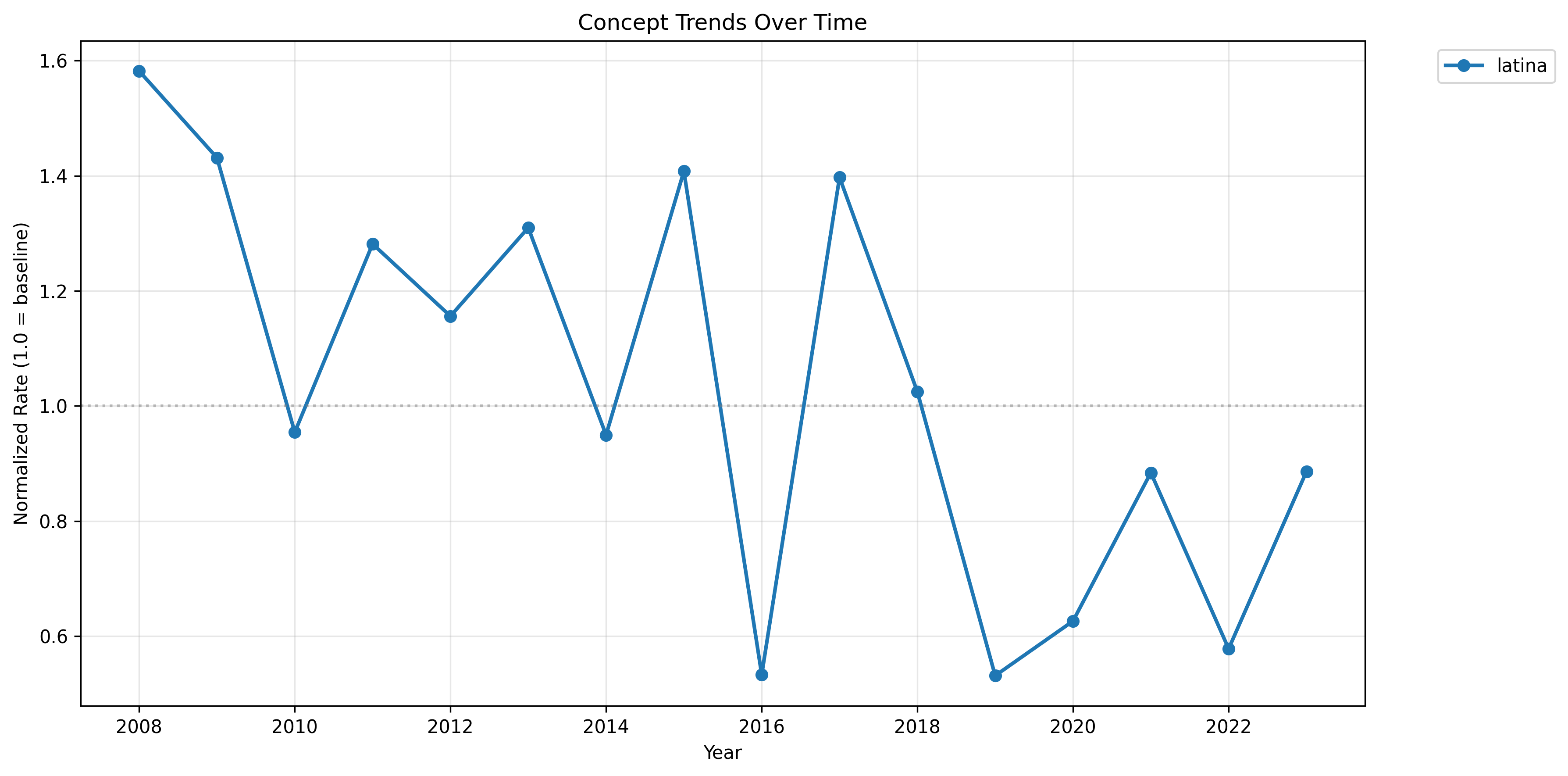
(08:57) Keyword Trends
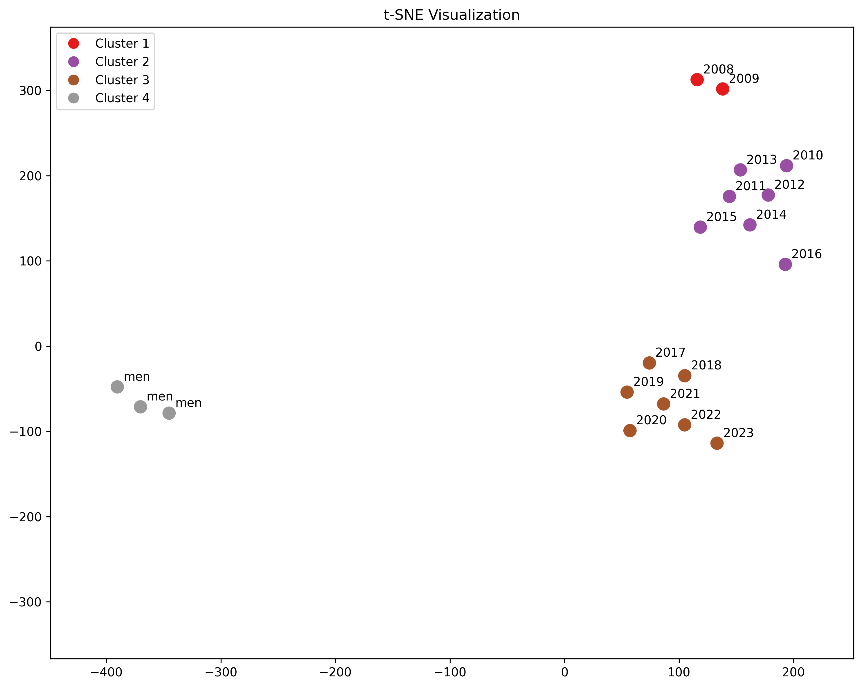
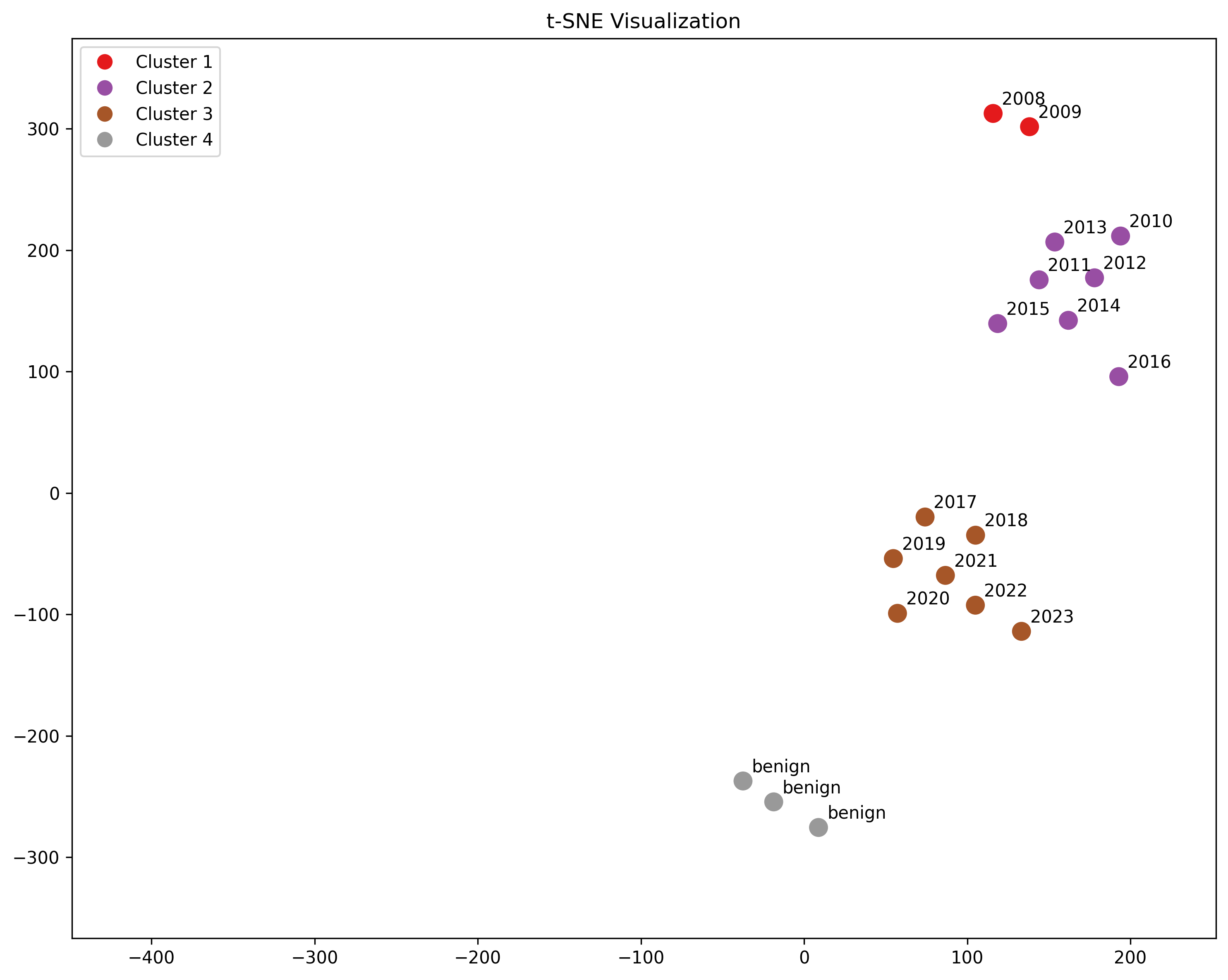
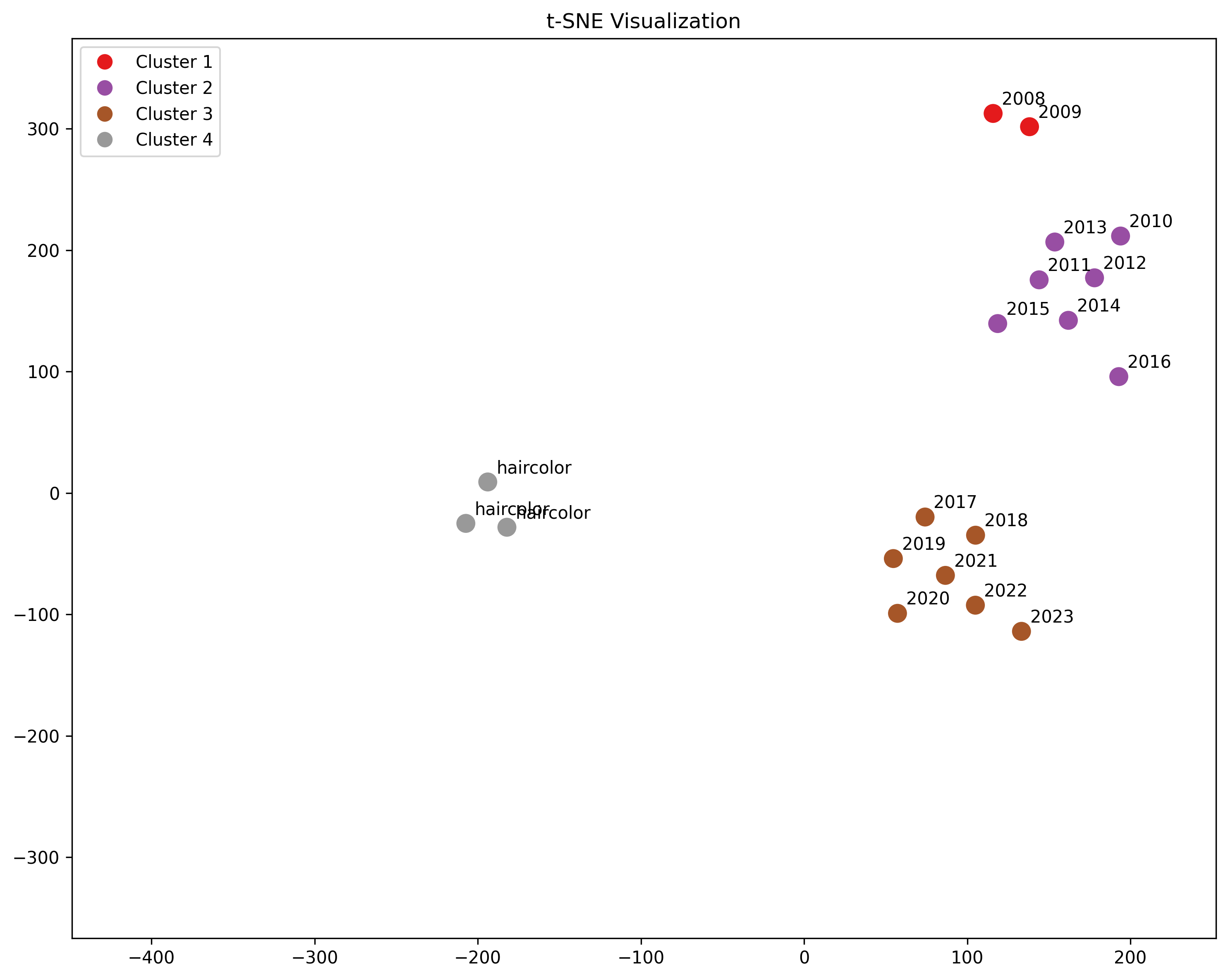
(11:30) t-SNE Clusters
(11:55) Haircolor
(12:22) Pornstar Names
(12:50) Violence
(13:14) Women
(13:36) Men
(14:02) Racial
(14:25) Manufacturing
(15:02) Benign
(15:29) Sexual Violence
(16:58) Conclusions
---
First published:
May 19th, 2025
---
Narrated by TYPE III AUDIO.
---
Images from the article:
Apple Podcasts and Spotify do not show images in the episode description. Try Pocket Casts, or another podcast app.
Senaste avsnitt
En liten tjänst av I'm With Friends. Finns även på engelska.