
I recently read an article where a blogger described their decision to start masking on the subway:
I found that the subway and stations had the worst air quality of my whole day by far, over 1k ug/m3, ... I've now been masking for a week, and am planning to keep it up.
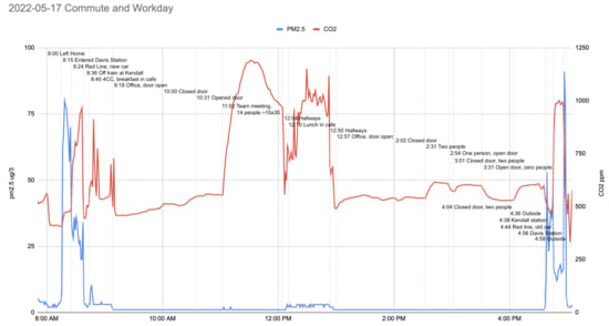
While subway air quality isn't great, it's also nowhere near as bad as reported: they are misreading their own graph. Here's where the claim of "1k ug/m3" (also, units of "1k ug"? Why not "1B pg"!) is coming from:
They've used the right axis, for CO2 levels, to interpret the left-axis-denominated pm2.5 line. I could potentially excuse the error (dual axis plots are often misread, better to avoid) except it was their own decision to use a dual axis plot in the first place! Hat tip to [...]
---
First published:
July 9th, 2025
Source:
https://www.lesswrong.com/posts/rj75cGJhPCHnPMDvF/subway-particle-levels-aren-t-that-high
---
Narrated by TYPE III AUDIO.
---
Images from the article:
Apple Podcasts and Spotify do not show images in the episode description. Try Pocket Casts, or another podcast app.
Senaste avsnitt
En liten tjänst av I'm With Friends. Finns även på engelska.